Key takeaways
- Write one promise: who the product is for, the job and a result a new user can see in the first session.
- Keep the promise, one primary CTA and a real product screen above the fold, where NN/g measured 57% of viewing time.
- Pick the CTA by sales motion: a free trial or freemium plan when users reach value alone, a demo when setup needs a person, and both when a separate buyer signs.
- Map every homepage claim to a first-session screen in a promise ledger, then rewrite the claim or build the missing path.
- Judge the homepage by what its sign-ups do next: sign-up completion, activation rate and time to first value.
Put your software as a service (SaaS) homepage design to a test that takes 2 minutes. Open your homepage and read only the headline, then sign up in a private window and look at the first screen after the form. Does that screen start the job the headline promised?
I treat SaaS homepage design as the design of one promise and its handoff. The headline, sections, proof and call to action (CTA) on the front page of a SaaS site set an expectation. The first session in the product has to meet it.
Communication design is my job at ui-ux.agency, tkxel's design team, whose designers have worked on 200+ digital products since 2017. On our SaaS design agency projects, the homepage is designed with the pricing page and sign-up, not as a separate website job. Below, I follow a visitor from the headline to the first result: the promise, the section order, the CTA choice, the handoff with a worksheet I call the promise ledger and the tests for the whole path.
What is SaaS homepage design, and what is it for?
SaaS homepage design shapes the first page of a software company's marketing site so the right visitor signs up expecting exactly what the product shows next.
The work covers the headline, section order, product visuals, proof and the call to action that moves a visitor to start a trial or book a demo. In its five homepage design principles, Nielsen Norman Group (NN/g) treats the homepage as an elevator pitch that communicates who you are and what you do. Unless your company name already says what you do, NN/g recommends a concise tagline that does.
I'd add a second job: the homepage is the first screen of a new user's journey, not a brochure. In an Ask Me Anything (AMA) session hosted by Pocus, Ramli John, author of Product-Led Onboarding, describes the first milestone as the moment a person perceives your product's value. That moment can happen while reading your landing page, before sign-up; experiencing the value comes later, inside the product. So the best homepage design for a SaaS website is the one whose promise the product keeps.
Unlike a campaign landing page, a SaaS homepage serves every visitor type, so it carries a navigation bar and several paths. Each of those paths still has to lead to the product the headline describes.
Everything on the page depends on one sentence: the promise.
What promise should a SaaS homepage make?
Good SaaS homepage design promises one result, for one kind of customer, that a new user can see inside the first session.
The promise is your value proposition in one line, and my formula has three parts: who it's for, the job and the result you can see. NN/g's tagline advice points the same way: say what the company does, especially when people don't know you yet, because vague or jargon-heavy taglines make visitors mistrust the site.
Wes Bush of ProductLed explains why the wording matters after the click. In his onboarding framework, as Productboard summarizes it, perceived value is the promise your product makes and experienced value is how well the product delivers on it. The strongest product-led companies keep the two closely aligned.
So I treat the perceived value vs experienced value gap as a design spec. A bigger promise can lift sign-ups and then sink activation when the product can't show the result fast.
Here's the formula applied to three hypothetical US products.
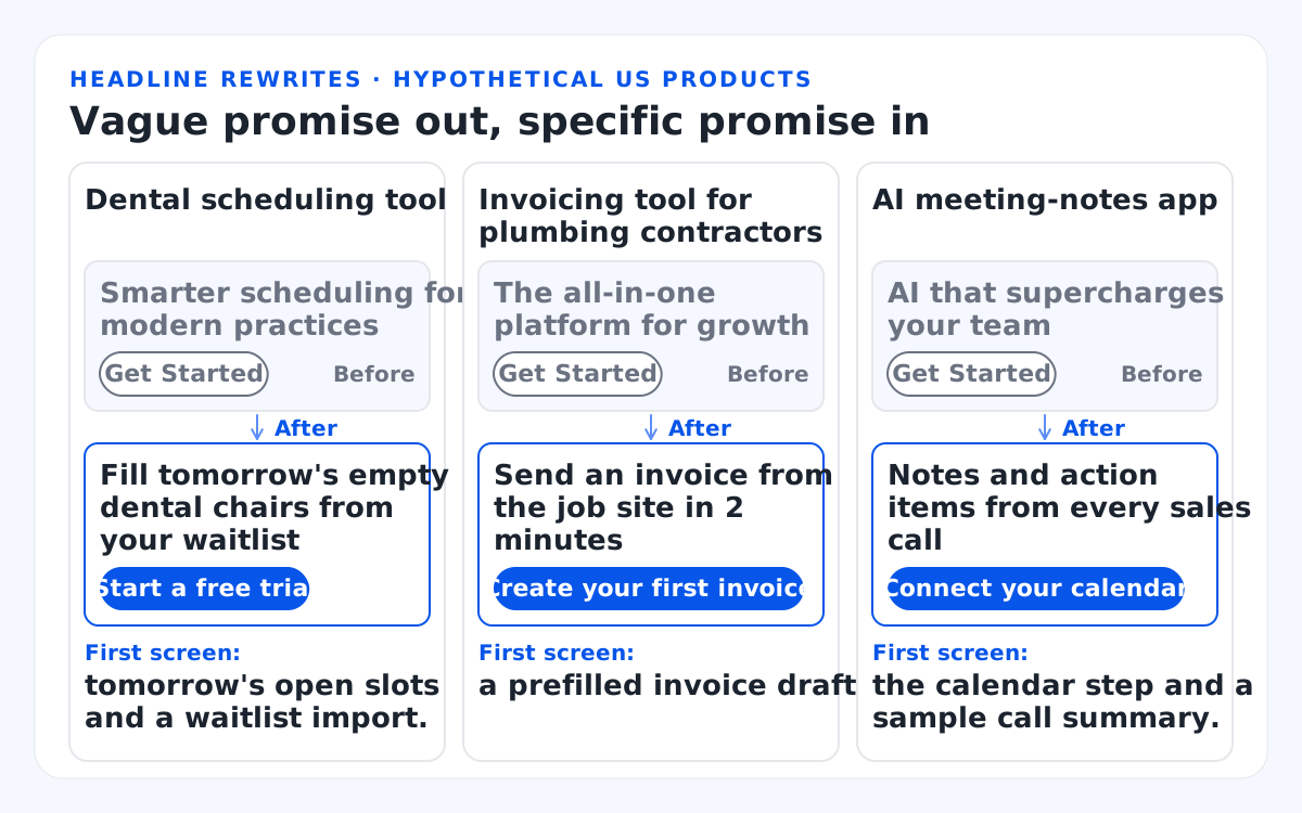
Three illustrative rewrites for hypothetical US products:
- Dental scheduling tool. Before: "Smarter scheduling for modern practices" + "Get Started". After: "Fill tomorrow's empty dental chairs from your waitlist" + "Start a free trial". First screen: tomorrow's open slots and a waitlist import.
- Invoicing tool for plumbing contractors. Before: "The all-in-one platform for growth" + "Get Started". After: "Send an invoice from the job site in 2 minutes" + "Create your first invoice". First screen: a prefilled invoice draft.
- AI meeting-notes app. Before: "AI that supercharges your team" + "Get Started". After: "Notes and action items from every sales call" + "Connect your calendar". First screen: the calendar step and a sample call summary.
My test: can a new user see this result before they close the first tab? If the headline's result isn't on the first screen or one step after it, the headline promises the roadmap, not the product. Write your headline in the formula before you design a single section.
A promise needs evidence, and the rest of the page supplies it in a set order.
Which sections belong in SaaS homepage design, in order?
Most SaaS homepages need 9 to 10 sections, ordered so the first screen carries the promise and the CTA, and each section below answers the buyer's next doubt.
Above the fold is where attention concentrates. In NN/g's 2018 eyetracking study of scrolling and attention, 57% of page-viewing time went to the first screenful and 74% to the first two, down from 80% above the fold in its 2010 study. So the hero section carries the hero headline, a subheadline, the primary CTA and a real product screenshot.
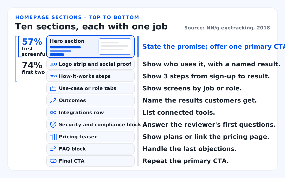
This table lists each homepage section, its job and what it must match in the product. The band beside the wireframe shows NN/g's 2018 attention split: 57% of viewing time on the first screenful and 74% on the first two.
| Section | Its job | Must match in the product |
|---|---|---|
| Hero section | State the promise; offer one primary CTA. | The first screen after sign-up starts this job. |
| Logo strip and social proof | Show who uses it, with a named result. | Results a new customer can reach too. |
| How-it-works steps | Show 3 steps from sign-up to result. | The real first-run steps, in order. |
| Use-case or role tabs | Show screens by job or role. | Screens in the shipped product. |
| Outcomes | Name the results customers get. | Metrics the product displays. |
| Integrations row | List connected tools. | Integrations live today. |
| Security and compliance block | Answer the reviewer's first questions. | A SOC 2 report or security page you can share. |
| Pricing teaser | Show plans or link the pricing page. | Plan names and limits used in billing. |
| FAQ block | Handle the last objections. | Answers your terms back up. |
| Final CTA | Repeat the primary CTA. | The hero's label and destination. |
No pixel rule sets page length. Length follows the doubts a buyer brings, so a $20 per month tool needs fewer sections than a $50,000 per year platform.
In SaaS homepage design, I prefer a real product user interface (UI) over abstract illustration, because the screenshot previews the first-run experience. Check it at every release, since an old screenshot promises screens nobody will find.
The section that decides whether any of this pays off is the button.
Should the homepage CTA be a free trial, freemium or demo?
Pick the homepage CTA by sales motion: trial or freemium when users reach value alone, a demo when setup needs a person, both when a separate buyer signs.
In product-led growth, the free plan or trial does the selling, so the CTA opens the product. In a sales-led motion, a "book a demo" path hands the visitor to sales.
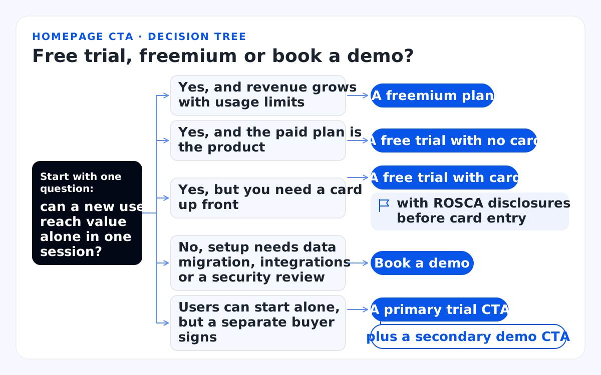
Start with one question: can a new user reach value alone in one session?
- Yes, and revenue grows with usage limits: a freemium plan.
- Yes, and the paid plan is the product: a free trial with no card.
- Yes, but you need a card up front: a free trial with card, with ROSCA disclosures before you collect card details.
- No, setup needs data migration, integrations or a security review: book a demo.
- Users can start alone, but a separate buyer signs: a primary trial CTA plus a secondary demo CTA.
Label the button with what happens next. NN/g found that a "Get Started" button stops users because the label fits almost any goal, so visitors who wanted details about the company land in surveys, onboarding flows or sales funnels instead. Its advice is to state precisely what users should expect. "Start a free trial" passes that test.
Keep one primary CTA per screen and a visually lighter secondary CTA.
If your free trial takes a credit card and turns paid, the Restore Online Shoppers' Confidence Act (ROSCA) applies. The Federal Trade Commission (FTC) sums up ROSCA as three duties: disclose all material terms before collecting billing details, get express informed consent before the charge, and offer a simple way to stop recurring charges.
The Eighth Circuit vacated the FTC's 2024 click-to-cancel rule in its entirety on July 8, 2025, as law firm Cooley reported. The FTC restarted the process on March 11, 2026 with only an advance notice of proposed rulemaking, which poses questions instead of rule text. So ROSCA and state auto-renewal laws still set the bar. This isn't legal advice; ask your counsel, and write "No credit card required" only when it's true.
When plans are public, I add a pricing teaser or a clear link to the pricing page, so visitors can find the plan that fits before they sign up.
Whatever the button says, the next screen has to agree with it.
How does SaaS homepage design carry into the product?
Map every homepage claim to the screen where a new user experiences it, keep the sign-up form short and make the first screen start the job the headline promised.
Most homepage advice stops at the click. I follow the visitor four steps further.
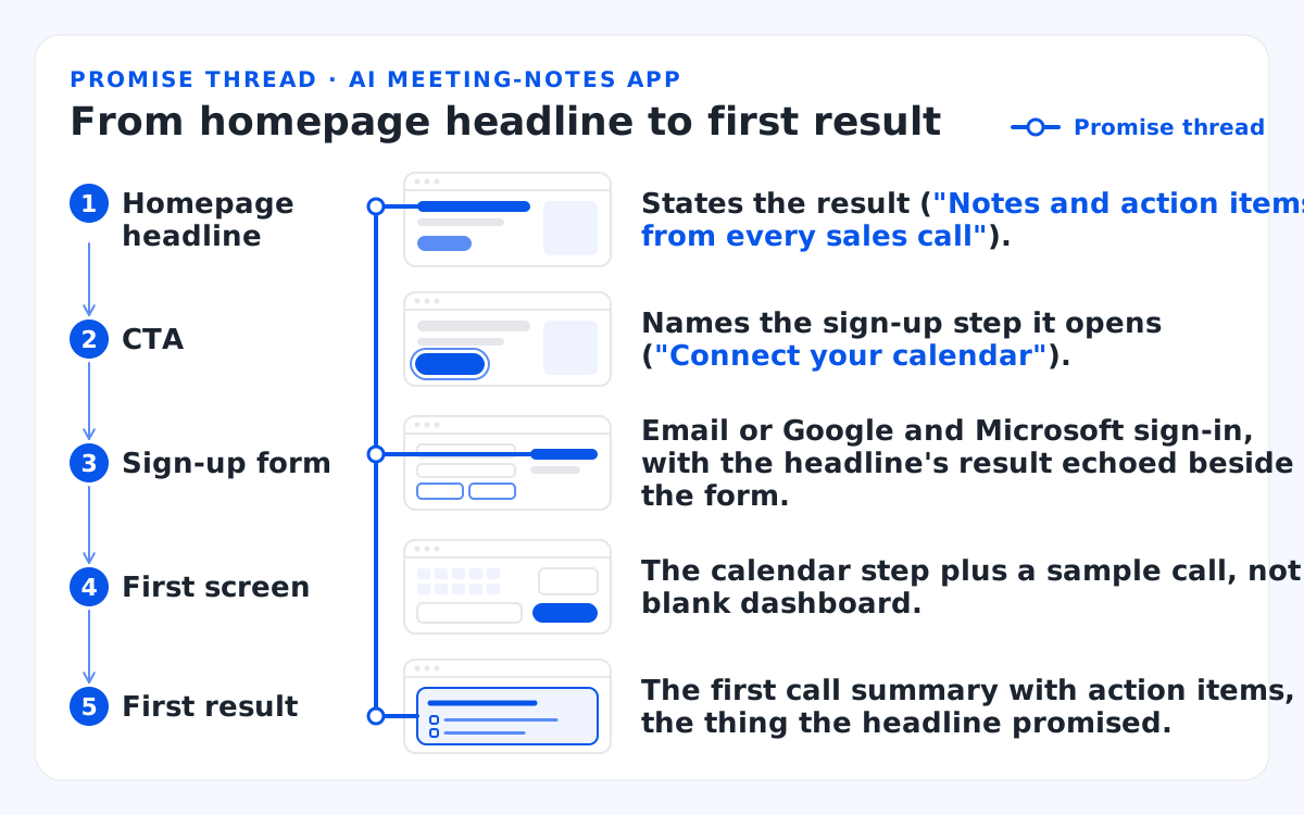
The hypothetical AI meeting-notes app, step by step:
- Homepage headline: states the result ("Notes and action items from every sales call").
- CTA: names the sign-up step it opens ("Connect your calendar").
- Sign-up form: email or Google and Microsoft sign-in, with the headline's result echoed beside the form.
- First screen: the calendar step plus a sample call, not a blank dashboard.
- First result: the first call summary with action items, the thing the headline promised.
On the sign-up form, ask only for the fields the account needs. NN/g's checklist for registration and login forms on mobile says to ask only for the minimum; ideally, email and password should be enough. It also recommends Google or social sign-in and no repeated fields, such as a second password field.
Single sign-on (SSO) through Google or Microsoft lets many business-to-business (B2B) visitors sign up with an account they already have, without creating a new password. I'd echo the homepage promise beside the form, so visitors know they're on the same path.
If the headline promises a call summary, the first screen offers a sample call or one connection step toward it, not a blank dashboard. In its guidelines for empty states in complex applications, NN/g treats a blank container as a design opportunity: a designed empty state communicates system status, teaches unused features and offers a direct path to key tasks.
Our sign-up and onboarding deliverable covers account creation, workspace setup, invites and a checklist that leads to the first result. When your gap sits in sign-up, setup and empty states, that's SaaS onboarding design work, and that service owns the patterns.
Fill in the promise ledger
The promise ledger is a one-page table I fill in before any visual design. Each homepage claim gets a row: the screen where a new user sees it, the minutes from sign-up to that screen, a kept-or-missing mark and the fix. A claim with no screen in the first session gets rewritten, or the first run gets redesigned.
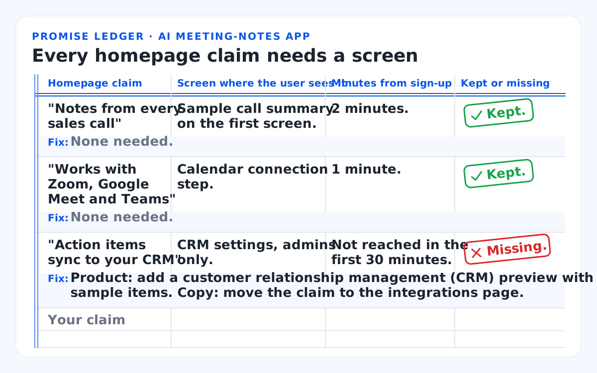
This table shows three illustrative ledger rows for the hypothetical AI meeting-notes app, plus a row for your own claims.
| Homepage claim | Screen where the user sees it | Minutes from sign-up | Kept or missing | Fix |
|---|---|---|---|---|
| "Notes from every sales call" | Sample call summary on the first screen. | 2 minutes. | Kept. | None needed. |
| "Works with Zoom, Google Meet and Teams" | Calendar connection step. | 1 minute. | Kept. | None needed. |
| "Action items sync to your CRM" | CRM settings, admins only. | Not reached in the first 30 minutes. | Missing. | Product: add a customer relationship management (CRM) preview with sample items. Copy: move the claim to the integrations page. |
| Your claim |
Copy can be fixed alone in an afternoon; a missing first-run path can't. Found claims marked missing that a rewrite won't solve? That's the work our team takes on: homepage, sign-up and first screen designed together. We judge that work by 2 or 3 metrics agreed at kick-off, usually activation rate, time to first value and trial-to-paid conversion.
How one team designed Digno's website and web app
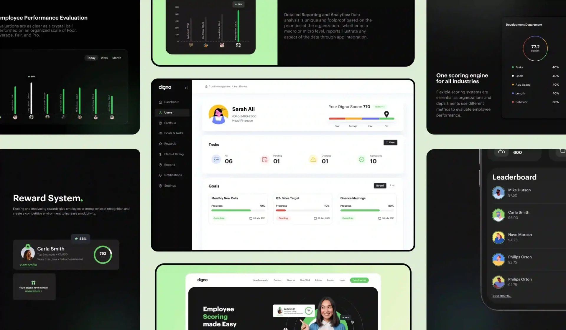
For Digno, a human resources (HR) tech SaaS with an artificial intelligence (AI) scoring engine, we delivered both the website and the web app. Its homepage leads with "Employee Scoring made Easy", walks visitors through how Digno works and invites them to try it free. One team shaped the promise and the product it points to.
The product keeps that scoring promise on its main screens. The organization dashboard puts the company health score and a leaderboard on one screen, and each employee gets a My Digno Score page that explains the factors behind the number. Name the product screen that proves your own headline, the way the score pages prove Digno's.
B2B homepages add a twist: the person who signs up isn't always the one who signs the contract.
How does a B2B SaaS homepage serve buyers and users?
A B2B SaaS homepage gives two readers a path under one promise: the user who wants the job done and the buyer who needs proof and security.
Four roles read a B2B homepage: the end user, the admin, the economic buyer and the security reviewer. Use-case or role tabs let each find their screens, with the promise above the tabs. The same split holds for a vertical SaaS homepage built for one industry and for an AI SaaS homepage, where buyers also ask what happens to their data.
For buyers, I'd place social proof with a named customer and a named result ahead of an anonymous logo wall, because a buyer can check a name. A security page with your System and Organization Controls 2 (SOC 2) report status answers the reviewer before the first call. Claim only what you hold: Health Insurance Portability and Accountability Act (HIPAA) language belongs only on products that handle health data.
The demo form should ask only for the fields that route the lead, and the demo should open on the first-run screens the homepage pictures. List your four readers and the one doubt each brings, then check that the page answers all four.
The homepage is one page of several, and they have to read as one product.
What does web design for SaaS need beyond the homepage?
Web design for SaaS needs a small page set that carries the homepage promise forward: pricing, feature pages, use cases, integrations, security, sign-up and the first app screen.
Good web design for SaaS treats those pages as one path, each with one job:
- Pricing page: plans, limits and the upgrade path, in the plan names billing uses.
- Feature pages: one job each, with the real screen that does it.
- Use-case pages: one role or industry each, linked from the role tabs.
- Integrations and security pages: what connects today, SOC 2 status and a contact for reviewers.
- Sign-up page: the headline's promise echoed beside the form.
Marketing site design and product design often sit with two teams, and that split is where screenshots drift. SaaS website design that stops at conversion-focused web design tunes the click and ignores what follows. So one design system runs across site and product; our design system deliverable is a Figma component library with tokens that match the front-end code.
Teams that want the site and product designed as one system can see how our SaaS product design work fits together. Start by listing the pages a visitor passes on the way to sign-up.
Once the pages exist, test the path, not just the page.
When and how do you test SaaS homepage design?
Test in two stages: before launch, check that people grasp the promise and find the CTA; after launch, judge the page by what its sign-ups do in the product.
Before launch, I run three checks in this order:
- Five-second test: show the hero and headline for 5 seconds, then ask what the company does and for whom; wrong answers mean a rewrite.
- First-click test: ask testers where they'd click to start the job; the primary CTA should win.
- Moderated session: watch 5 users go from the homepage through sign-up to the first screen.
First impressions form fast, but that evidence is narrow. In a 2006 Carleton University study by Lindgaard and colleagues, visual-appeal ratings of homepages seen for 50 milliseconds agreed well with ratings after longer viewing, as Nature's news coverage of the study reported. The finding covers visual appeal only, not trust or understanding, so the five-second test asks about the promise.
After launch, the funnel below ties each stage to a metric and a test.
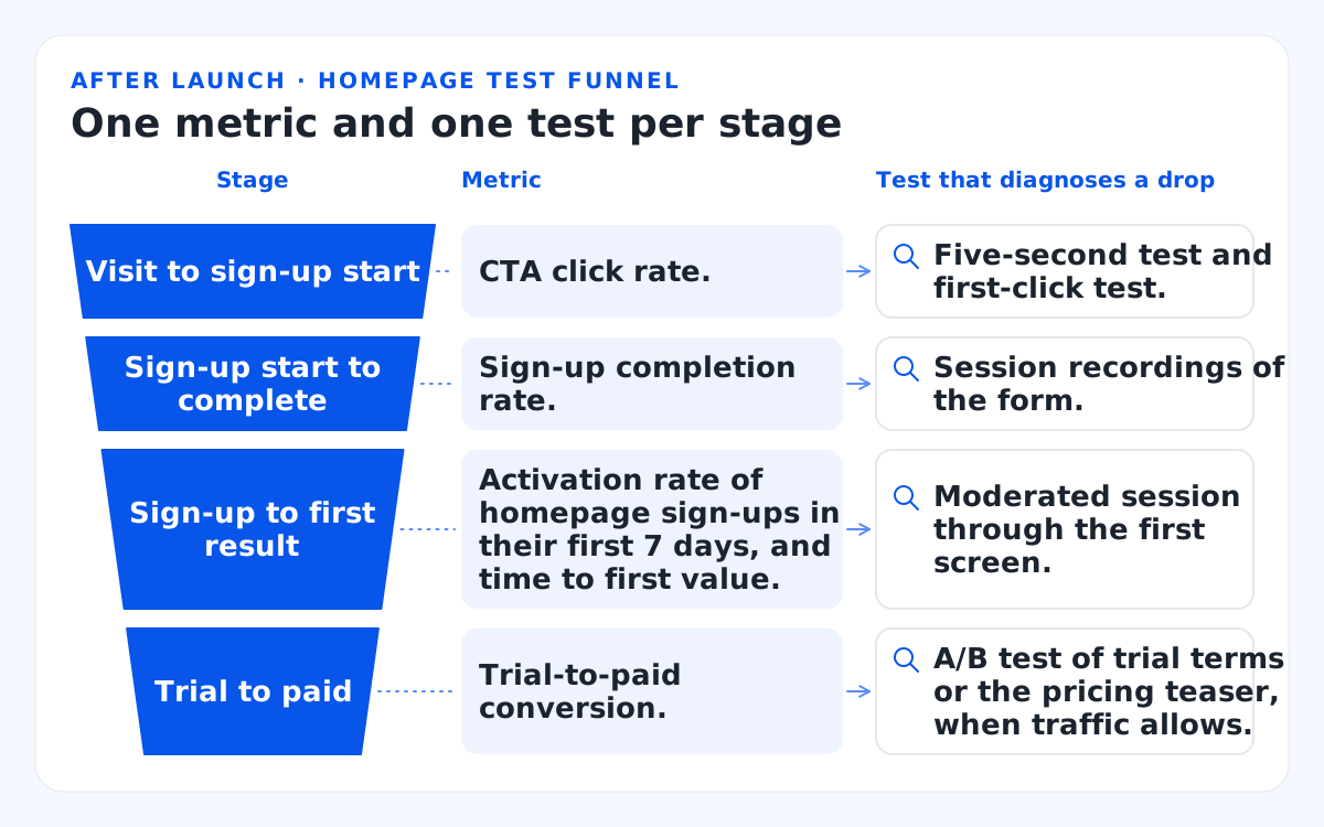
This table maps each funnel stage to its metric and the test that diagnoses a drop.
| Stage | Metric | Test that diagnoses a drop |
|---|---|---|
| Visit to sign-up start | CTA click rate. | Five-second test and first-click test. |
| Sign-up start to complete | Sign-up completion rate. | Session recordings of the form. |
| Sign-up to first result | Activation rate of homepage sign-ups in their first 7 days, and time to first value. | Moderated session through the first screen. |
| Trial to paid | Trial-to-paid conversion. | A/B test of trial terms or the pricing teaser, when traffic allows. |
For context, Unbounce's 2024 SaaS conversion benchmark puts the median SaaS landing page conversion rate at 3.8%, against 6.6% across all industries. That's a landing-page figure, so I compare a homepage with its own trend before and after a change.
Two technical gates follow. For Core Web Vitals, Google's web.dev guidance sets a good Largest Contentful Paint (LCP) at 2.5 seconds or less. Its Interaction to Next Paint (INP) guide sets a good INP at 200 milliseconds or less, both measured at the 75th percentile of page loads. Google's web.dev guide counts images and video poster images among LCP candidates, so I check the hero image or hero video first.
For accessibility, I design to Web Content Accessibility Guidelines (WCAG) 2.2 AA, with the Americans with Disabilities Act (ADA) and Section 508 as the US frame. Three WCAG 2.2 success criteria (SC) matter most on a homepage:
- Contrast, SC 1.4.3: text needs 4.5:1 and large text 3:1, including hero copy over screenshots or gradients.
- Target size, SC 2.5.8: buttons need at least 24 by 24 Cascading Style Sheets (CSS) pixels or enough spacing.
- Focus not obscured, SC 2.4.11: a focused control must stay at least partly visible, so a sticky cookie banner fails if it entirely hides the focused hero CTA.
Microsoft Clarity session recordings and heatmaps then show where visitors stall. Run an A/B test on one element at a time once traffic allows, and I'd let each run for at least 2 full weeks so weekday and weekend visitors both count. A low-traffic B2B site learns more from moderated sessions.
Most failed tests trace back to a handful of mistakes.
Which SaaS homepage design mistakes break the promise?
The costliest mistakes make a promise the first session can't keep: a vague headline, a generic CTA, stock art instead of the product, and a sign-up that asks too much.
The table below pairs each mistake with why it breaks the promise and where the fix belongs.
| Mistake | Why it breaks the promise | Where the fix belongs |
|---|---|---|
| A category headline ("the platform for growth"). | Visitors can't tell what result they'll get. | Copy: rewrite with the formula. |
| "Get Started" with no destination. | The click lands somewhere unexpected. | Copy: name the next step. |
| Stock art or an outdated screenshot. | The first screen won't match the picture. | Page: show the current product UI. |
| A logo wall with no named result. | Logos prove presence, not outcome. | Page: add one named result. |
| Job title, company size and phone on the sign-up form. | Those 3 fields delay the result. | Sign-up: ask after the first result. |
| A blank dashboard as the first screen. | The promised result is nowhere in sight. | Product: start the promised job. |
Fixes in the product column need design work, not copy. When that column fills up, the homepage, sign-up and first screen belong in one project; our full-product engagements run 6 to 16 weeks. Count your product-column rows first, because they set the size of the job.
Bottom line
SaaS homepage design succeeds when the first session keeps the headline's promise, the sections answer buyer doubts in order, and the page is judged by what sign-ups do next.
Spend 30 minutes filling in the promise ledger for your homepage. For every claim marked missing, book a free consultation. We design the marketing site, pricing page and sign-up flow together, so the homepage and the first minutes in the product tell one story. A senior designer replies within one business day, ET.
I'd rewrite a headline only after the first screen can show its result.
FAQs
Is a SaaS homepage the same as a landing page?
No. A landing page serves one campaign or audience with one CTA. A homepage serves every visitor type, so it carries navigation, several paths and the company's main promise.
Should the homepage show pricing?
Yes, when your plans are public: a short pricing teaser or a clear link to the pricing page lets visitors check fit before they sign up. Sales-led products can link a pricing overview next to the demo CTA instead.
How long should the homepage be?
As long as the buyer's doubts, so price and complexity set the length, not a pixel count. Keep the promise, the CTA and a real product screen on the first screenful, which drew more than half of viewing time in NN/g's eyetracking.
Can you build the homepage from a template?
Yes, for layout. A template can't write your promise or design your sign-up and first screen, and that part of SaaS homepage design decides whether homepage visitors reach a first result.
How do you measure homepage success?
Measure what homepage visitors do next: CTA click rate, sign-up completion, activation rate of homepage sign-ups and time to first value. Compare each before and after the redesign, not against an industry median.