About TradeZella
TradeZella is a SaaS trading journal and analytics product that puts a trader's entire workflow in one tool. Inside it, traders get:
- live market data
- advanced charts
- order execution
- a trade journal
- detailed performance analytics
We set out to make it simpler and easier to approach for beginners and seasoned traders alike.
What we covered: discovery and stakeholder interviews, a product revamp, UI/UX design, plus web and mobile app design.
Why the old experience held traders back
The features were strong, but four UX problems kept satisfaction and engagement down:
- A busy, crowded interface. The metrics traders care about most were hidden under clutter.
- Hard to learn. New users took long to get productive.
- No onboarding guide. First-time traders had nothing to walk them through setup.
- Different on every device. Web and mobile did not behave the same way.
With TradeZella's founders, we aimed to lift the whole experience, with dashboard analytics as the main focus.
What we redesigned
This SaaS product redesign rebuilt the web and mobile apps around the way traders review their own results. We concentrated on five areas.
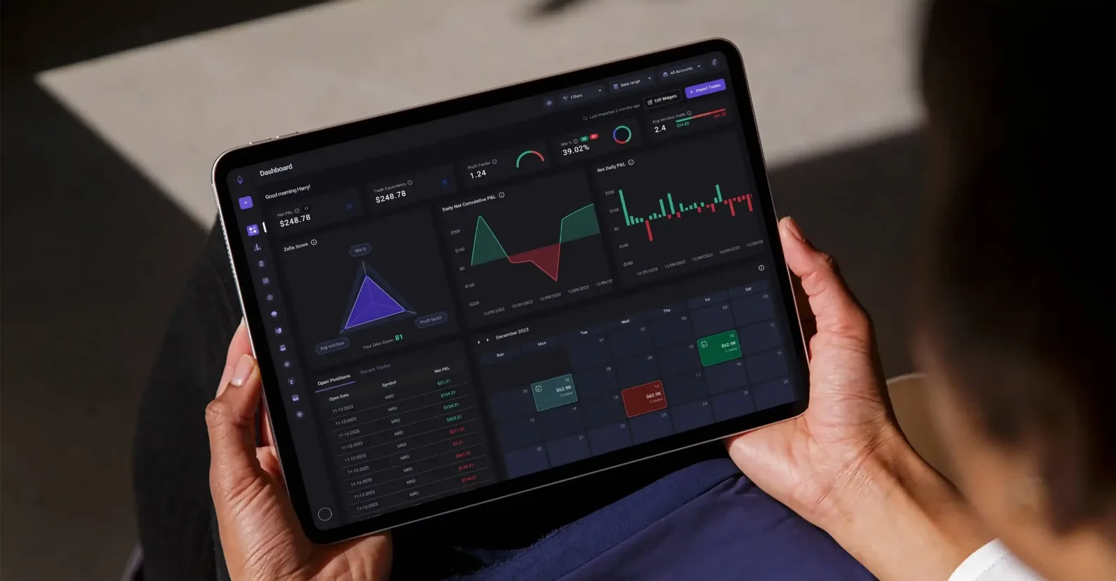
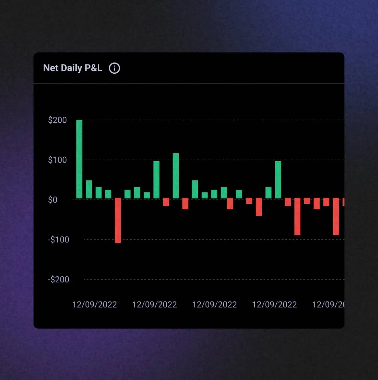
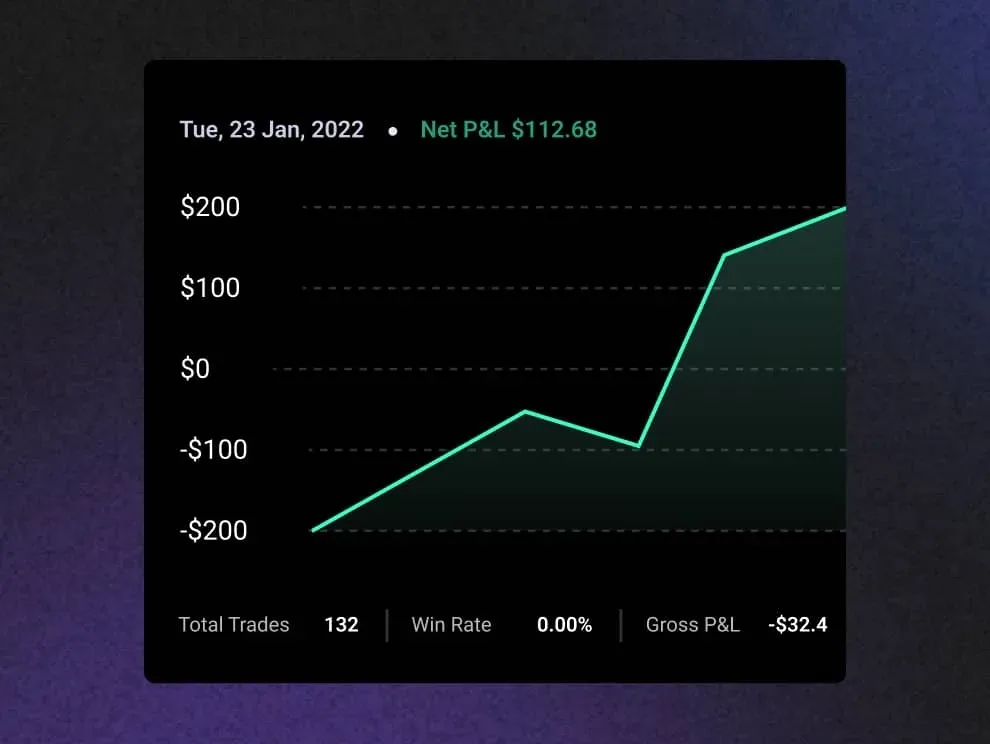
Net daily P&L to track progress
One look tells a trader if a day made or lost money and which way the account is heading.
Analytics that help traders grow
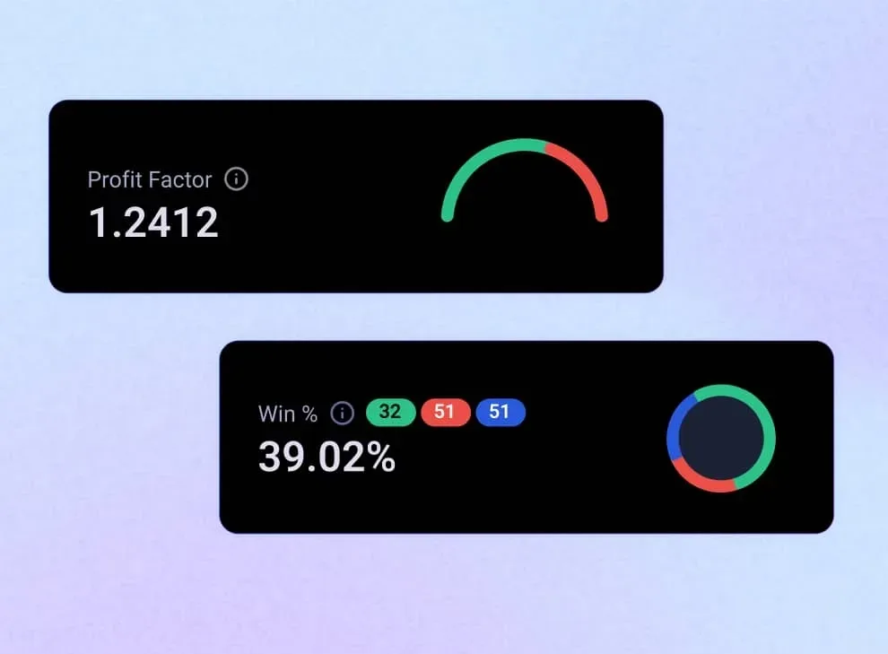
We pulled ratios such as win rate and profit factor into compact widgets that read in a second.
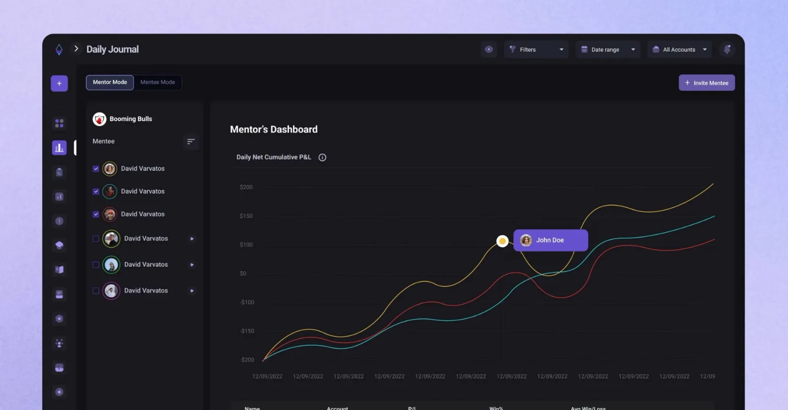
A journal built for coaching
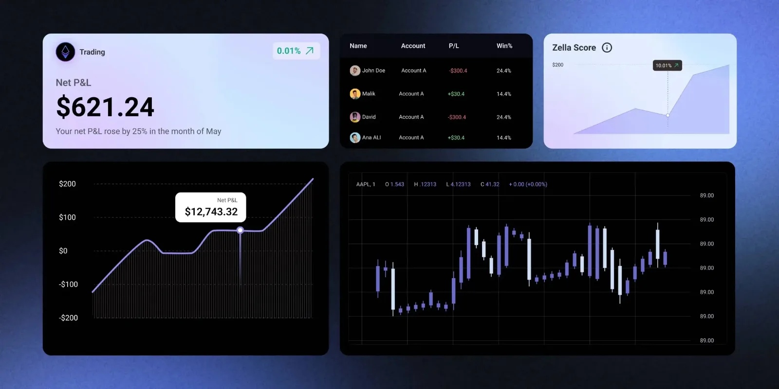
In mentor mode, a coach compares the cumulative P&L of every mentee in one view, so the advice they give can point to real numbers.
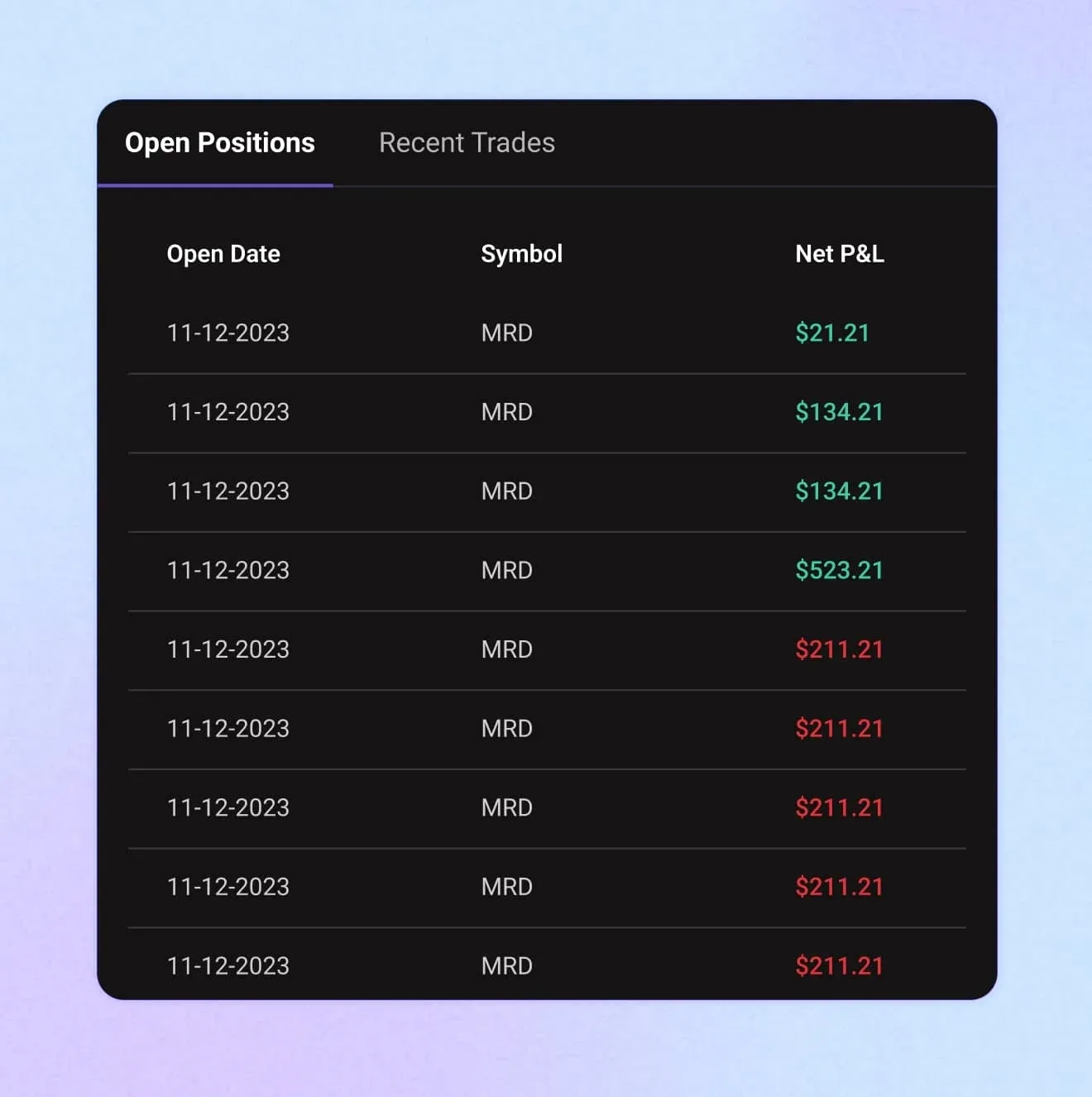
Positions and market activity in plain sight
Recent trades and open positions are a single tap away, with green and red marking gains and losses.
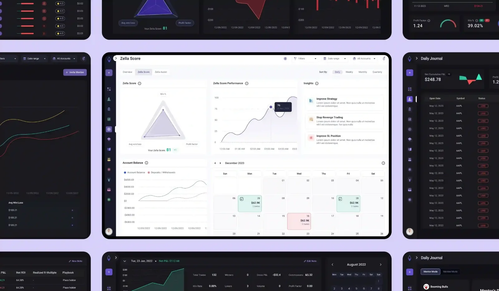
A dashboard each trader can shape
Each trader picks and arranges the widgets that fit their style: the Zella Score, a P&L calendar, the account balance and more.
How we got there
We started with discovery and ended with trader testing. Stakeholder sessions first showed us TradeZella's long-term vision.
Next, we redrew the user flows around the widgets and features traders open most, so they navigate faster and focus on profitable trading.
Finally, the visual design follows proven patterns for financial dashboards, and traders tested it before it went live.
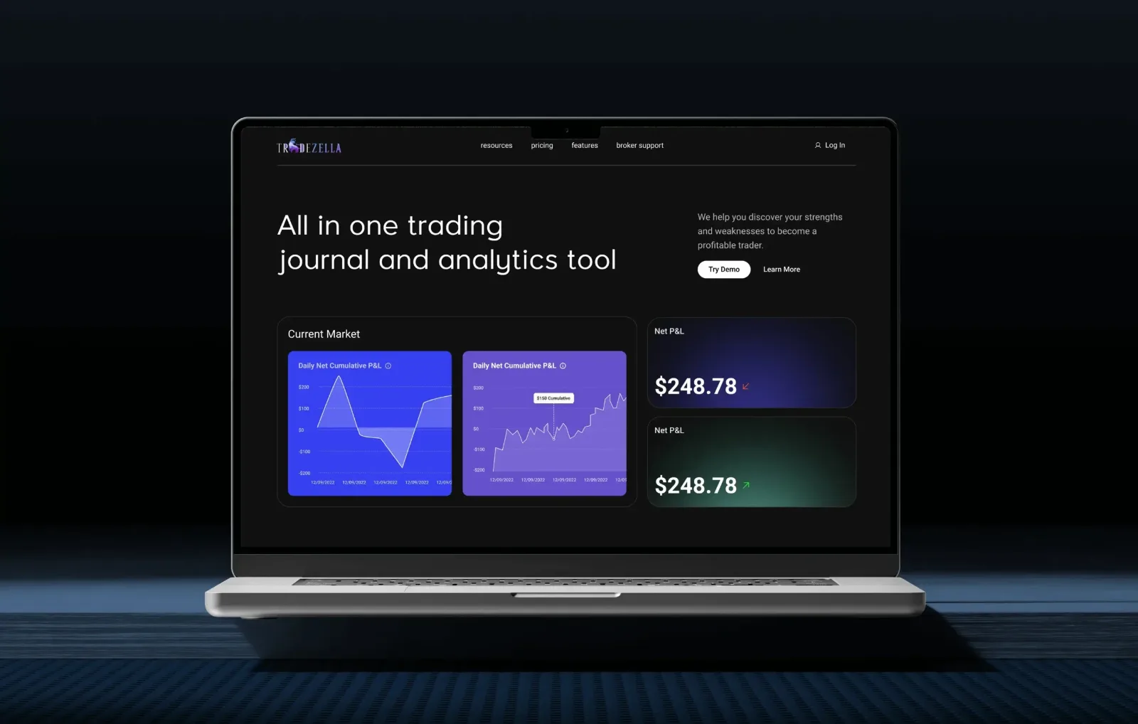
The results
Traders responded to the new dashboard with real enthusiasm. The redesigned product looked sharper, felt easier and gave the launch strong momentum:
| Metric | Result |
|---|---|
| User interaction | +40% |
| User retention | +25% |
| New customers | +30% |
| Trustpilot rating | 4.7 |
Need that lift for your analytics product? Our SaaS design agency team starts with discovery.