Key takeaways
- SaaS onboarding ends at the activation event, so name that event before you redesign a single screen.
- Sort every step before first value into keep now, move later or cut, and rebuild the flow from the keepers.
- B2B products need two paths: admins set up the workspace, invited members land on work that already exists.
- Each onboarding email should fire on behavior and open the one in-app step the user left unfinished.
- Overlay tools add guidance on top; drop-off in the form, the setup wizard or a blank screen needs the screens redesigned.
When I review a software as a service (SaaS) product, the first number I check in its SaaS onboarding is how many minutes a new user spends before getting anything they came for. So I time a fresh sign-up with a stopwatch. Here's a hypothetical business-to-business (B2B) trial:
0:00 Sign-up form: 7 fields, including company size and phone. 0:52 "Verify your email." Switch tabs, find it, click. 2:15 Setup wizard, 9 steps. Step 1: pick your industry. 4:30 Step 4 of 9: connect an integration the user doesn't have yet. 6:10 An empty dashboard: "No projects yet."
After 6 minutes, nothing they came for has happened, and that's where a trial quietly ends.
At ui-ux.agency, the design team of tkxel, our designers have worked on more than 200 digital products since 2017. Our onboarding work starts the same way: we watch new-user session recordings and measure drop-off from sign-up to first value. Everything between that form and the first result worth a second visit is new user onboarding.
What is SaaS onboarding, from a designer's view?
SaaS onboarding is the designed route from a new account to the first result a user cares about, plus the nudges that bring them back for a second session.
When I say onboarding, I don't mean a welcome email or a kickoff call. I mean the first minutes and days a new user spends in subscription software: sign-up, account setup, team invites, empty states and guidance toward the first result. I design it as a user onboarding flow with a measurable finish line, in three layers:
- Screens: sign-up, setup and the first task, where real work happens.
- Guidance: checklists, tooltips and tours placed on top of those screens.
- Messages: emails and in-app prompts that reach the user after they stop.
I start with the screens underneath, because they decide the outcome. So our SaaS onboarding design work redesigns sign-up, setup and empty states, not only the guidance on top.
One naming trap: in the Amazon Web Services (AWS) SaaS Lens, "tenant onboarding" provisions a new tenant's resources and creates its admin in an identity provider. That's engineering work, so when a team says "onboarding", I first ask which layer they mean.
User vs customer onboarding: which are you fixing?
User onboarding happens inside the product and scales through screens; customer onboarding is a guided program run by people, and most B2B SaaS products need both.
B2B SaaS customer onboarding usually runs on two tracks with two owners: the product team's screens and a customer success manager (CSM), who runs kickoff, training and go-live. Yet the product must still work for the 20th invited member, who never joins that call.
The table below compares owner, place, trigger, end point and scale.
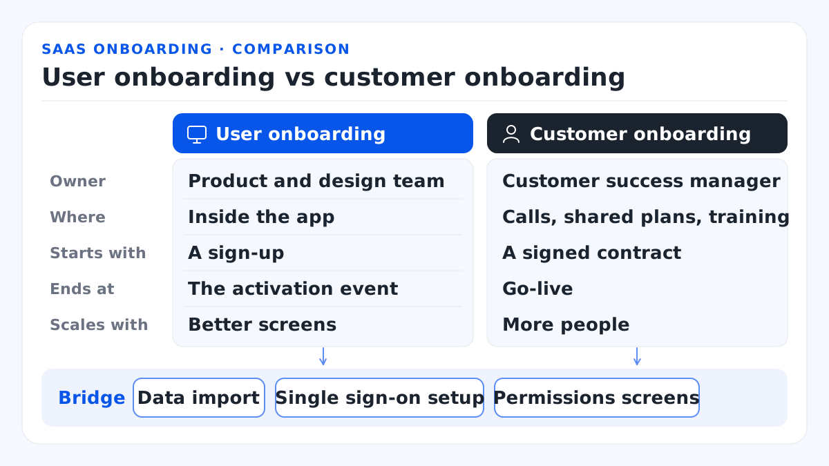
This table sets user onboarding against customer onboarding, row by row.
| Item | User onboarding | Customer onboarding |
|---|---|---|
| Owner | Product and design team | Customer success manager |
| Where | Inside the app | Calls, shared plans, training |
| Starts with | A sign-up | A signed contract |
| Ends at | The activation event | Go-live |
| Scales with | Better screens | More people |
Bridge: data import, single sign-on setup and permissions screens.
Work falls through at the handoff. Data import, single sign-on (SSO) setup and permissions sit between the CSM and the product team, so nobody designs them. I'd design them as guided setup screens, data import first, so a call is optional.
A SaaS customer onboarding checklist from customer success covers kickoff to go-live; my audit below covers screens.
Where does SaaS onboarding end?
Product onboarding ends at the activation event, the first action that predicts a user will stay, and every screen before it is judged by whether users get there.
Three numbers follow. Activation rate is the share of new sign-ups who reach that event within a set window, such as the first 7 days. Time to first value is the time from sign-up to the same event: minutes for a self-serve tool, days for a product that needs data first. Day-7 return rate is the share of new sign-ups who come back for another session 7 days later; it shows whether first value turned into a habit.
Only one stage comes after the activation event: the prompt that brings an activated user back for a second session. Some teams call the activation event the aha moment, the point where a user grasps the product's value; I don't, because analytics can log an action, not a feeling. Keep the activation window shorter than your free trial length, so a user who misses first value still has days left. Freemium onboarding has no trial clock, but I'd set the same window.
How do you find yours? In The Cold Start Problem, Andrew Chen quotes Slack co-founder Stewart Butterfield: of the teams that had exchanged 2,000 messages, 93% were still using Slack. Here's how I'd look for your own threshold in 3 steps, comparing users who stayed with users who left:
- In Mixpanel or Amplitude, take 90 days of sign-ups that are at least 30 days old and split them into users still active after 30 days and users who left.
- Compare what each group did in its first 7 days.
- Pick one action that is early, repeatable and tied to value.
Say you run a scheduling SaaS. "Calendar connected" only proves setup. I'd pick "first meeting booked by someone else through your link", because that's when the product does its job. Write yours in one sentence before you touch a screen.
What does the SaaS onboarding process look like?
The onboarding process runs in five stages: four lead to the activation event, a fifth brings the user back, and every other step moves later or gets cut.
The map below gives each stage its message and its metric, with the activation event as the finish line.
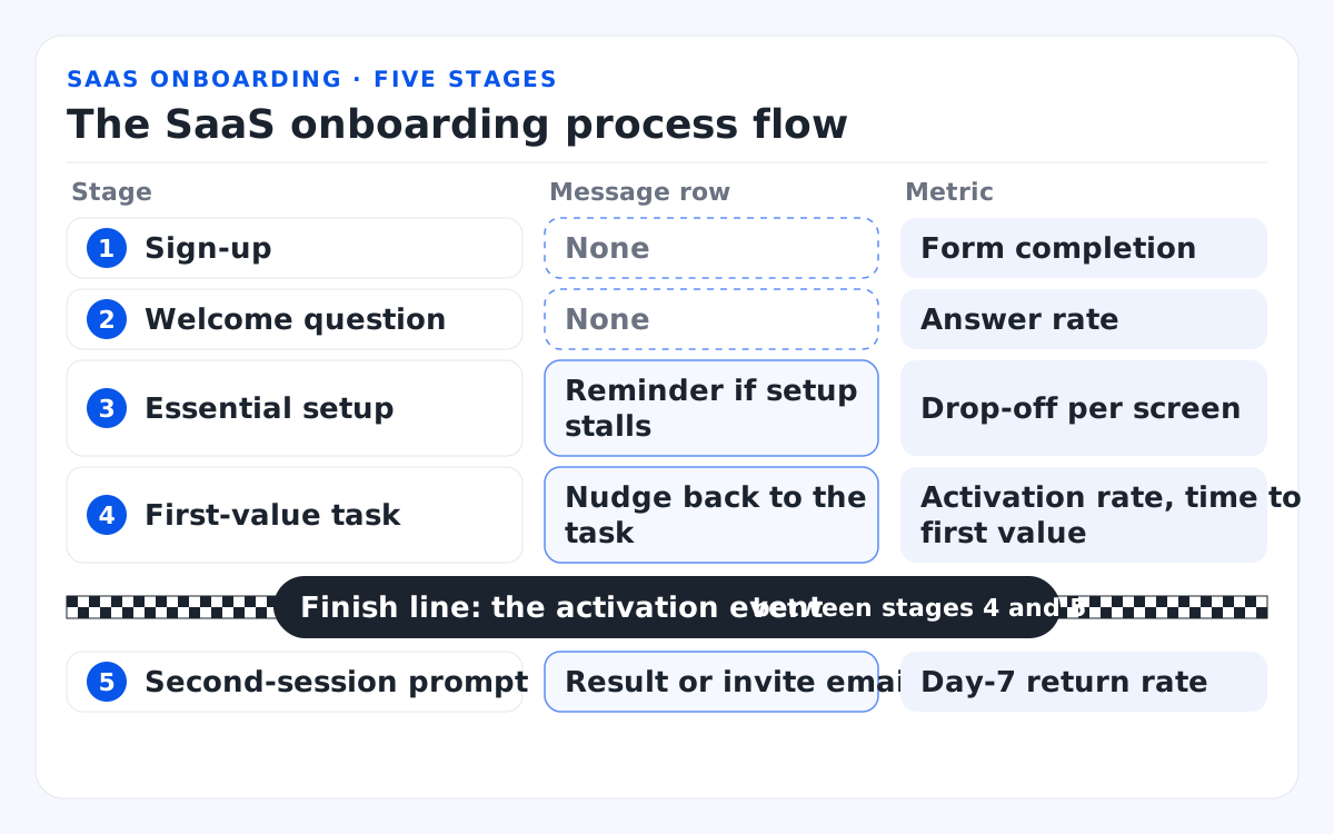
This table lists each stage of the SaaS onboarding process flow with its message and metric.
| Stage | Message row | Metric |
|---|---|---|
| 1. Sign-up | None | Form completion |
| 2. Welcome question | None | Answer rate |
| 3. Essential setup | Reminder if setup stalls | Drop-off per screen |
| 4. First-value task | Nudge back to the task | Activation rate, time to first value |
| 5. Second-session prompt | Result or invite email | Day-7 return rate |
Finish line: the activation event, between stages 4 and 5.
1. Sign-up
I keep the sign-up form short, with single sign-on and a plan choice that doesn't block the first session, because every required field is one more chance to quit. Against the 7 fields in my opening log, the scheduler asks for 1 field, a work email, or offers Google or Microsoft sign-in instead. Where security allows, I'd verify email after first value.
2. Welcome question
A welcome survey earns its place only if it changes what the user sees next, because every extra question delays the first result. The scheduler asks, "What will you book first: sales calls, interviews or support sessions?" and preloads the matching meeting type.
3. Essential setup
In self-serve trial onboarding, I ask only the setup questions the product needs now; the rest moves later, because each setup screen delays the result. The scheduler keeps the calendar connection, since booking cannot work without it, and starts availability from default hours. Profile, billing and notifications wait.
4. First-value task
I'd give the user a real task instead of a menu tour, with sample data and templates that cut the path to first value. In the scheduler, the booking link arrives pre-copied beside a preview of the booking page. The activation event follows when someone books through it.
5. Second-session prompt
Activation proves the product worked once; it doesn't build a habit. So give the user a reason to return: a result to check, a teammate to invite or one unfinished step. When a scheduler user comes back, the dashboard shows the booked meeting and 1 step left to finish.
In a B2B product, the SaaS customer onboarding process flow runs beside these five stages, and in-app onboarding splits at the team invite: admins finish setup, invited members skip it. Sketch your five stages and write the drop-off number under each.
How do you cut a SaaS onboarding flow to a straight line?
List every step between sign-up and the activation event, label each one essential, later or cut, and rebuild the flow from the essential steps only.
The method comes from Wes Bush's Bowling Alley Framework, a product-led growth (PLG) model for user adoption. The shortest route to value is the straight line; in-app guidance (product bumpers) and messages (conversational bumpers) keep users out of the gutters.
I run four tests on every step:
- Does first value need it, or does it change the next screen? It stays, because the first result depends on it.
- Can a default stand in? It moves later, since a sample or template does the job for now.
- Is there a better moment? Ask then, the way billing belongs at upgrade.
- Does the user ever need it? If not, cut it, like a job-title field only sales reads or an intro video.
Back to the scheduling SaaS: the sort cuts the number of steps from sign-up to first value from 11 steps to 4, with 5 steps moved later and 2 steps cut.
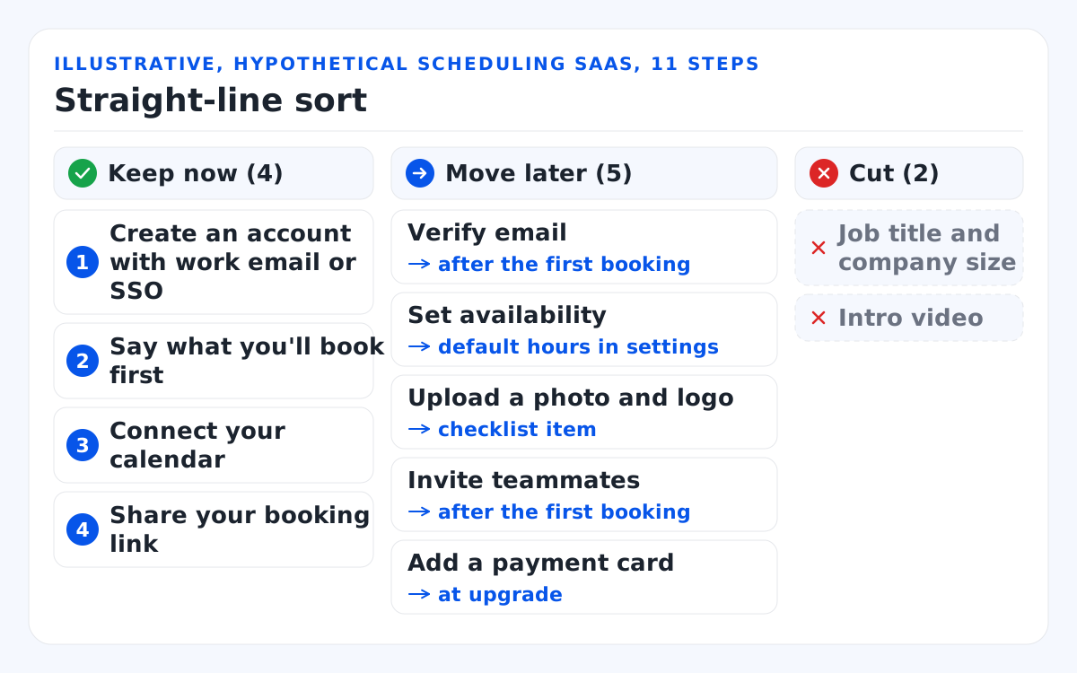
Illustrative, hypothetical scheduling SaaS, 11 steps:
- Keep now (4): create an account with work email or SSO; say what you'll book first; connect your calendar; share your booking link.
- Move later (5): verify email (after the first booking); set availability (default hours in settings); upload a photo and logo (checklist item); invite teammates (after the first booking); add a payment card (at upgrade).
- Cut (2): job title and company size; intro video.
Losing trial users before setup is done? Our design team rebuilds exactly that flow.
Which first-run patterns carry good SaaS onboarding?
Five patterns do most of the work in a SaaS first run: a personalizing welcome question, empty states with sample data, a short checklist, contextual help and templates.
Each helps the first-run experience at one moment and backfires outside it:
- Welcome question: helps when the answer changes the next screen; backfires as a survey only sales reads.
- Empty state: helps when it explains the blank and offers one action; backfires as a bare "No data yet".
- Onboarding checklist: helps when it ends at the activation event (I cap mine at 3–5 items); backfires with "watch a video" filler.
- Contextual help (tooltips): helps on the control the user is about to touch; backfires as a long tour at first login.
- Templates: help when filled with sample data that fits the welcome answer; backfire as an unfiltered library, because choosing becomes the task.
Notion pairs the first and last. Appcues' GoodUX teardown of Notion's onboarding describes it using sign-up answers to suggest a short list of templates, plus a learn-by-doing Getting Started checklist. Screens change between versions, so copy the pattern. Galleries such as SaaSFrame hold more onboarding flow examples.
Nielsen Norman Group (NN/g) warns that a blank screen in a complex app confuses users, and its guidelines for empty states ask a designed one to show system status, give learning cues and open direct paths into key tasks.
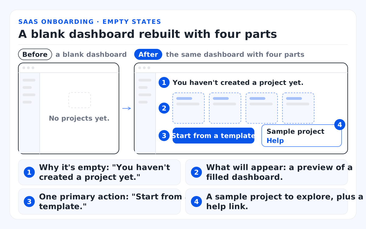
Before: a blank dashboard that says "No projects yet." After: the same dashboard with four parts.
- Why it's empty: "You haven't created a project yet."
- What will appear: a preview of a filled dashboard.
- One primary action: "Start from a template."
- A sample project to explore, plus a help link.
For the first session, I favor a guided first task over a product tour and its tooltips, because users remember their own first result. Then check your three busiest empty screens against the four parts.
How should B2B SaaS onboarding treat admins and members?
A B2B product needs two onboarding paths: the admin sets up the workspace and reaches first value, while invited members skip setup and land on work that already exists.
The number of user roles sets how many paths the onboarding flow needs; admin and member are the minimum.
- Invite timing: ask for team invites once the admin has something worth sharing, like a first project, so teammates don't arrive in an empty workspace.
- SSO and domain capture: in enterprise SaaS onboarding, members who sign in through the company's identity provider, or join via a verified email domain, skip a separate sign-up. Ask buyers which identity standard they require.
- Role-aware empty states: a member's first screen shows the admin's content and one assigned task, never a blank workspace.
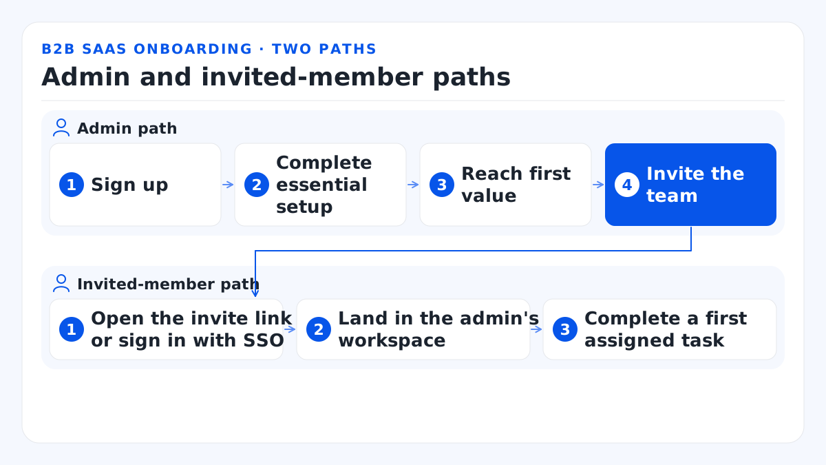
Admin path: 1. Sign up. 2. Complete essential setup. 3. Reach first value. 4. Invite the team.
Invited-member path: 1. Open the invite link or sign in with SSO. 2. Land in the admin's workspace. 3. Complete a first assigned task.
My quickest test of invited member onboarding: join your own product through an invite link. If you see the admin's setup wizard, that's your first fix.
How do SaaS onboarding emails fit the in-app flow?
Onboarding emails work best when behavior triggers them and each one links back to the user's next unfinished step, so the email ends inside the product.
A drip fixed at 1 day, 3 days and 7 days after sign-up ignores where the user stopped. I prefer behavior-triggered emails, which fire on what the user did or didn't do and open the exact step. In the scheduler's trial, the first onboarding email fires only if the calendar is still unconnected 24 hours after sign-up, and it brings inactive users back to that step.
The table below maps triggers to messages and target screens for the scheduling example.
| Trigger | Message | Opens on |
|---|---|---|
| No calendar 24 hours after sign-up | "Connect your calendar to show your free times" | Calendar connection |
| Link not shared 2 days later | "Your booking link is ready to share" | Share dialog, link copied |
| First booking received (activated) | "Bring your team onto your booking page" | Invite modal |
| No login for 5 days | The one unfinished checklist item | That checklist item |
The deep link must open the exact screen in the right state: logged in, correct workspace, task ready. I treat that as a design spec, not copywriting. Map each current email to a screen; rewrite or cut any with nowhere to land.
SaaS onboarding best practices: a 12-point audit
Run these 12 best practices as a pass/fail audit of your own first run, grouped by stage, and fix the earliest failing stage first.
Why the earliest? A user who quits at sign-up never sees your checklist. To me, good user onboarding UX (user experience) is mostly subtraction, and it pays most at the top. Here's how I run the audit in 4 steps:
- Open an incognito window, start a stopwatch and sign up as a new user.
- Capture the run with Microsoft Clarity session recordings or a screen recorder.
- Note every screen, every field and the minute you reach the activation event.
- Pull drop-off per step from Mixpanel, Amplitude or Google Analytics 4, then mark each box.
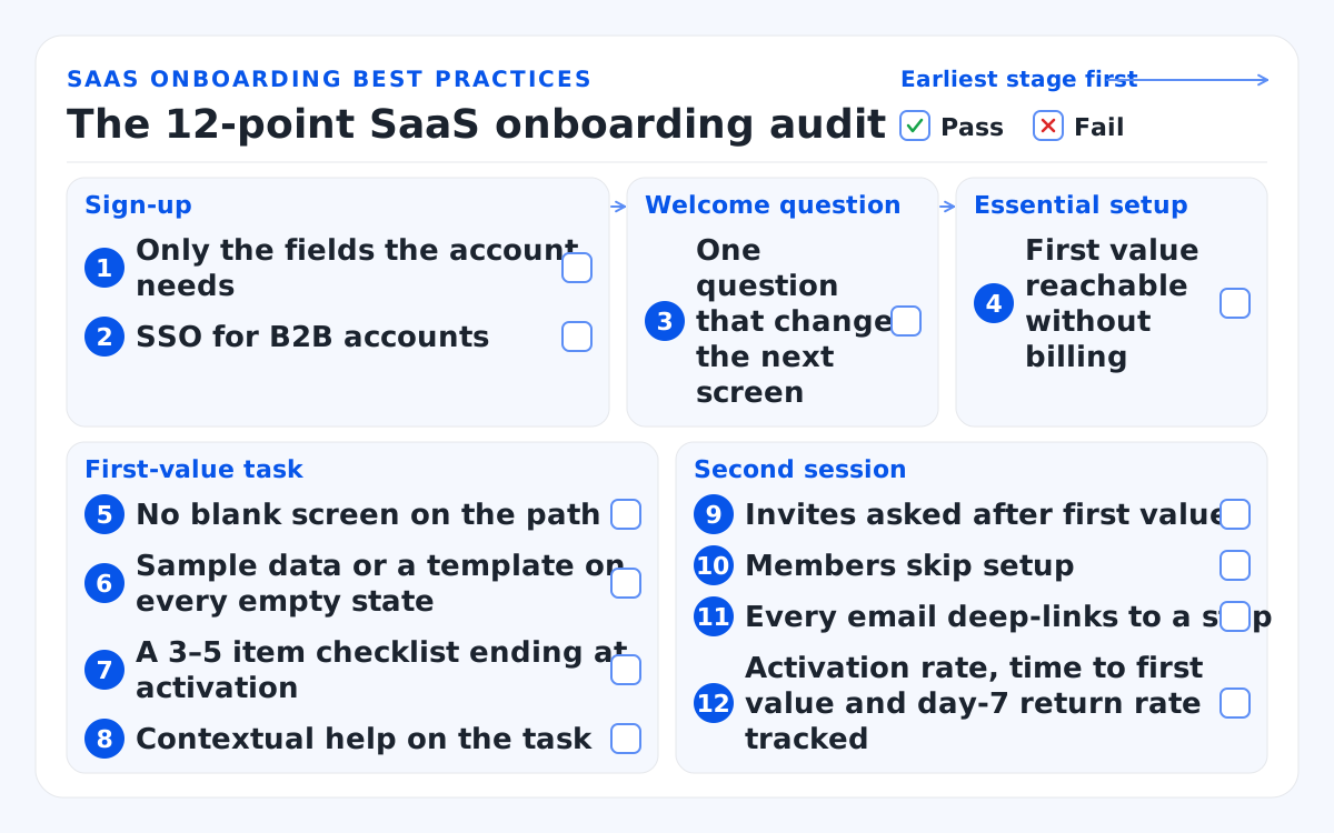
- Sign-up: 1. Only the fields the account needs. 2. SSO for B2B accounts.
- Welcome question: 3. One question that changes the next screen.
- Essential setup: 4. First value reachable without billing.
- First-value task: 5. No blank screen on the path. 6. Sample data or a template on every empty state. 7. A 3–5 item checklist ending at activation. 8. Contextual help on the task.
- Second session: 9. Invites asked after first value. 10. Members skip setup. 11. Every email deep-links to a step. 12. Activation rate, time to first value and day-7 return rate tracked.
Fix the earliest failing box, ship it, and rerun the audit after 7 days of new sign-ups.
When does SaaS onboarding need a designer, not a tool?
Trial onboarding needs design work when drop-off sits in the sign-up form, the setup wizard or a blank first screen, because an overlay tool can't change the screens underneath.
Onboarding tools such as Appcues, Userpilot and Pendo handle checklists, tours and in-app messages well, but they sit on top of your screens. So I read an audit this way:
- Failures in guidance and messages: a tool plus an in-house product manager can go far.
- Failures in sign-up, setup, empty states or the member path: the screens and flows need user experience design, and no overlay fixes that.
Our onboarding redesign runs in 4 steps: a funnel review (1 week), interviews with 5 to 8 recent sign-ups (1 week), a redesign and prototype tested with new users (1–3 weeks), then release and measurement (1 week). Here's what an onboarding redesign costs: $15,000 to $45,000. We judge the work by activation rate, time to first value and day-7 return rate.
Sometimes onboarding is one problem of many. Before we redesigned the TradeZella trading journal, "no onboarding guide" sat on its problem list beside a crowded interface and web and mobile apps that behaved differently. A product in that state needs a phased SaaS product redesign, one of the services in our wider SaaS product design work. If your dated screens go well past the first run, I'd start there.
Bottom line
Good SaaS onboarding starts from the activation event and moves or cuts every step that doesn't lead to it. I'd fix the earliest stage that fails, and inside that stage fix the screens before the guidance and the emails.
Time your own first run with a stopwatch, record it and send us a link to the recording for a free consultation. A senior designer replies within one business day (ET).
My recommendation: before you add another tooltip or email, move or cut 1 step between sign-up and your activation event.
FAQs
How long should SaaS onboarding take?
In-app onboarding should take as long as a new user needs to reach your activation event, and not one screen longer. I measure time to first value in minutes for a self-serve trial, and track a sales-led go-live separately. In the hypothetical scheduler, that path is 4 steps long.
What is a good activation rate for SaaS?
No universal activation rate benchmark exists, because every product defines activation differently. Userpilot's 2024 activation benchmark averages 37.5% across 62 B2B companies, but it's first-party vendor data from its own customers. I treat it as a sanity check and compare a product's own rate before and after each change.
Do you need a tool like Appcues or Userpilot for onboarding?
No. Checklists, empty states and behavior-triggered emails can be built in code. Tools speed up in-app guidance and testing, but they can't shorten a long sign-up form or fill a blank first screen.
How many onboarding emails should a SaaS trial send?
There's no fixed count. I'd send one behavior-triggered email per unfinished step that matters, stop when the user activates, and have each one open that step's screen.
Is SaaS onboarding the same as customer success onboarding?
No. SaaS user onboarding is the in-product path a new user follows alone; customer success onboarding is a people-led program from kickoff to go-live. Most B2B products need both, with the handoff screens designed.